Posts

Showing posts from December, 2023

Solar System in watercolour

Image
I used a whole sheet of Arches cold press 300lb watercolour paper for this interpretation of the solar system. I used reference photos from the NASA website which are public domain. It is such a large painting and I have such limited space that eventually I abandoned it but I guess it is done enough that I could call it finished. Or maybe I'll tweak it one day.  The painting in the early stages... The paint used was Schmincke Horadam from my self-customised box set...

Watercolour painting of baby harp seals diving under polar ice

Image
Once again I dove into unknown territory when I decided to paint seals diving. I chose baby harp seals for my subject as they have beautiful white fur when very young. If they look rather fat and round it is because they are, in real life, so cute! Doing a bit of research when looking for ideas for bubbles, I discovered that seals breathe out before they dive (to reduce buoyancy) and that enough oxygen is stored in their blood for them to be under water for quite some time. I wanted bubbles so I did some coming from the tail as I had seen in seal-diving videos where air was brought down into the water when they dive. Not sure I got the bubbles right but anyway...I used white gouache for them and all the other whites are unpainted paper (Arches cold press 300lb).  I chose to use Schmincke supergranulating blues for the water, from various Galaxy and Glacier ranges, sometimes mixing two together until I got what I wanted. It was quite difficult thing for me to paint (isn't everything...

Emperor penguins and chick in mixed media

Image
Another one that threw me into the deep end. I thought it would be relatively easy but I struggled with the sharp edges due to the texture of the paper (Arches cold press 300lb). I ended up edging with a Caran d'Ache 'Luminance' black pencil in places. Then there was the problem of the colour of the paper which is a light cream and far from snowy, so I brought out the dear old white gouache life saver. The sky was Schmincke Horadam supergranulating 'Glacier Blue' which I actually used thinly over the entire background then later daubed white gouache over to try and achieve a snowy effect. The dark paint used was Winsor and Newton's 'Payne's Grey' and Mijello Mission Gold's 'Ivory Black'.   I can see all the flaws in the painting, they glare out at my critical self, but I had to stop before I ruined it altogether!  I think the hardest thing to paint was the Emperor penguin chick. I'm still unhappy with it. I'm not well versed with ...

Fox and Snowdrop in watercolour / mixed media

Image
I thought I would try a winter scene, something I don't think I have ever done, and for the subject I chose a fox looking at a snowdrop poking its head above the snow. Although I started off with it being total watercolour, it didn't quite end that way.  I used Arches 300lb cold press for this so I could use plenty of water for the sky without the paper buckling. The sky was Schmincke Horadam Supergranulated 'Galaxy Black'. The red of the fox was Daniel Smith's Quinacridone Gold and Quinacridone Deep Gold. For the snow I used Schmincke Horadam white gouache. The darker browns were a mix of Schmincke Horadam orange and browns until I was reasonably happy. To create the snow on the fox's body I used a Jackson's 'Silverline' Series 982 3/4 comb brush. Around the fox's eye and for the snowdrop green I used a Caran d'Ache 'Luminance' pencil and for the flower petals I used a Coliro metallic 'Sterling Silver' so it would pop. 

Easy watercolour using templates

Image
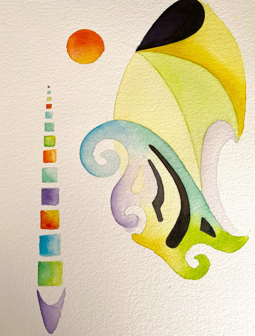
I painted this last summer. Sometimes, often, usually actually, I get a mental block of what I want to paint next and spend so long mulling about it that I could have painted something during that time. This is a watercolour I made using plastic templates, just for the fun of it. I like most of it except for that top right yellow and black thing that looks like a windsock! 😆

Painting over a watercolour disaster with watercolour

Image
A couple of weeks ago I painted a total disaster in my Strathmore watercolour journal and I had a choice of ignoring it, cutting the page out, or trying to fix it.  I couldn't possibly ignore it, it would have bugged me forever. I didn't want to cut the page out without at least trying to remedy it. The original artwork itself was unfixable but I applied a lot of water and lifted as much paint out of the paper as I could. Bear in mind that this journal is not cotton and it does not play nicely!  I was left with very pale colour, a couple of fine unremovable lines, some stubborn gray sections right at the bottom, and a piece torn out of the paper where the masking tape ripped the top surface off.  I thought about what was left on the paper and decided it had to be a seascape so I went at it with Holbein watercolours and did the best I could. The palm tree could be better (it hides some horrors!) but there is a point when you just know you have to leave it. It all could be ...

Dragon painting with metallics on mulberry paper

Image
I painted this dragon quite a few years ago now. It's a small, experimental, painting using Coliro metallic paints on a good quality mulberry paper which I had glued around the edges to good quality cold press paper. I used Pritt Stick glue for that. I wanted to know if I could paint on the mulberry paper and it was tricky, the mulberry paper losing strength with the liquid metallics but it was supported to a great degree by the backing. I had to be careful but it was so effective. The only thing I don't like about it are the flames coming out of the dragon's mouth. I should have done a single column of fire fanning out like it would from a flame-thrower. The mulberry paper I bought online came in a package of many coloured textured sheets. I was looking for a demo of someone painting mulberry paper to share with you and I came up with a video on the YouTube channel: 'Oriental Art Supply'. I note the artist has affixed her mulberry paper to a card backing. I've ...

Neurographic Art with Caran d'Ache 'Luminance'

Image
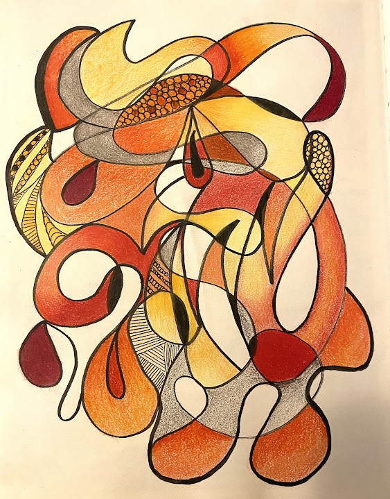
Creating this piece of art in my Hand-book drawing journal was so relaxing, so undemanding, the sort of thing I could do while watching a no-brainer movie. This is one I did a couple of  years ago when I first started using colouring pencils. Not sure I quite got the hang of it, or whether I was doing it right but I was happy with the result. There are lots of YouTube videos about how to apply light pressure and increase pressure to build up colour, and how to blend etc. At the time, I didn't know what this kind of art was called, or even that it had a name, and I just called it doodling but apparently it is neurographic art. There is some fancy definition for it but I just think of it as doodling with my brain switched off.  The coloured pencils I used were Caran D'ache 'Luminance' which are an oil and wax blend and the black pen was Faber-Castell 'Pitt Artist' pen.  I've popped a couple of links to the subject of neurographic art on my External Links page ...

Leafy avenue using Neopastels by Caran D'ache

Image
My second painting (is it painting or drawing? I'll call it painting) using Neopastels by Caran D'ache is of a leafy autumn avenue and was relatively easy.  One of my favourite abstract artists is Leonid Afremov and although he is no longer with us, he leaves behind a legacy of the most innovative of styles. His work is recognisable immediately and he has many aspiring artists worldwide trying to emulate that style.  I didn't even try but I remember his fearless use of colour and so my leafy avenue has purples and blues and mauves that aren't really representative of autumn.  I started with the black for the trees and for this I used a Faber-Castell Pitt Artist pen with a chisel 'nib'. I knew that I wanted the light to come from the end of the road and that is pretty much it. Again, as with the first Neopastel painting I did, I used Sansodol solvent to make the pastels spread (Caran D'ache Neopastels are not as mushy as some brands, and some colours among t...

Leopard face using Coliro metallics on Stonehenge 600gsm black paper

Image
Once again, I painted another member of the large cat family, this time a leopard and I think it was harder than both the tiger and the lion. I discovered that you can actually mix Coliro metallic colours but I was out of my depth. What progress can be made in our attempt to achieve perfection—even if that goal will always be out of reach—if we only paint the easy stuff?  One mistake I made was trying to draw the leopard's whiskers using wax crayon. The paper's texture resulted in broken lines and all too late I discovered that the ideal tool for the job was a Sakura Gelly Roll pen, size 10.  I'm not joking when I say that the painting looks far better in the journal than it does on screen where all the flaws shout out loud.  I need to thank IanZA on Pixabay for the copyright free use of his reference image and I'll put a link to it in my External Links page .