Posts

Showing posts with the label Mijello Mission Gold

Cherry blossom tree and birds on Yupo paper

Image
I think Cherry blossom tree and birds was my first attempt on Yupo paper, I call it paper but it is really a washable plastic which can be used over and over again.  While Yupo is difficult to work with, it also can give some amazing results. This was created used that vibrant watercolour brand, Mijello Mission Gold. I wondered what I could make of it using Grok Imagine and here is my best result. 

Koi carp and lily pads in a journal

Image
I am trying so hard to get back into painting and instead of just relaxing and splashing about, I keep trying to do something worthy of hanging on a wall which is rather ridiculous seeing as how I am painting in a journal! I'm really pleased with the Strathmore Mixed Media journal; it does take watercolour very well and although the painting is rather overworked, I still think it looks pretty.  The inside cover of the Strathmore journal looked a little bare so, although it is not watercolour quality paper on the inside cover, I decided to try and connect it to the Koi Carp painting. It was more of a doodle than a plan but I think it works, kinda. Imagine paying $1.8 million dollars for a fish.  I wanted to make a Grok Imagine video of the carp painting and it was a little tricky. These are early days for Grok Imagine and some of the conversions to video were a little weird, like two fish morphing into one.  I think this one will do.  

Dianthus in watercolour and ink

Image
It's been quite a while since I felt like painting and, as a lot of artists know, once you break off it can be so hard to get back into it. I have been distracted by an out-of-control garden and numerous other things. I decided to paint small and start a journal showing my garden from the very start of what was a blank canvass of unkempt grass right up until present. That's the idea anyway. I have a lot of photographs since 2009 so I won't be stuck for ideas and it is often the coming up with an idea that gives artists the equivalent of writer's block.  I would like to add that the Strathmore Mixed Media journal is really really good with watercolours. I didn't expect it to be but it is. I used Mijello Mission Gold paint, some Coliro green metallic, outlined with a Faber-Castell Pitt Artist pen, and then splashed around a bit with pink because it was SO boring without. 

COMPLEMENTARY PAGES IN A JOURNAL

Image
I like, when the pages of my journals are open, for the 'artwork' to be complementary in some way to form a cohesive whole, so I watercolour-doodled an abstract, letting the Mijello Mission Gold paint and colours do as they will, then outlined shapes with a Faber-Castell Pitt Artist pen.  How it looks when the pages are open.

EASY WATERCOLOUR VASE AND FLOWERS WITH FOUR COLOURS

Image
I have not been in the mood for anything too complicated or laborious in watercolours so I've been, more or less, doodling in a journal. The transparent flowers are painted with Mijello Mission Gold watercolours 'Bright Opera' and 'Bright Violet'. The vases and foliage were painted with Mijello Mission Gold 'Leaf Green' and 'Viridian'. The ink outlining was with a Faber Castell Pitt Art Pen 0.1. I just roughly painted petal shapes in very diluted Bright Opera and then when dry overlapped the petals with diluted Bright Violet. Sometimes I didn't even bother to let the bottom petals dry properly.  The vase was trial and error. I wasn't bothered about shape perfection any more than I was with the flowers, but I wanted depth of colour and interest. I painted a very dark tonal value of Viridian and when it was partially dry dropped small amounts of clear water into it with the tip of my clean brush, creating watercolour blooms.  The behaviour of w...

Doodling on a colourful abstract watercolour

Image
While I find inspiration for a larger painting for my living room wall, I am resorting to using my journals. I have some gloriously colourful sheer fabric which I bought years ago just because it is gloriously colourful, and it was the inspiration for this painting. I put loads of Mijello Mission Gold paint on the paper with a lot of water and let it do it's thing. Then I doodled around shapes with Faber-Castell Pitt Artist fineliner. The journal is by the Hand-Book Journal company. 

A collection of ferns in line and wash (or pen and wash)

Image
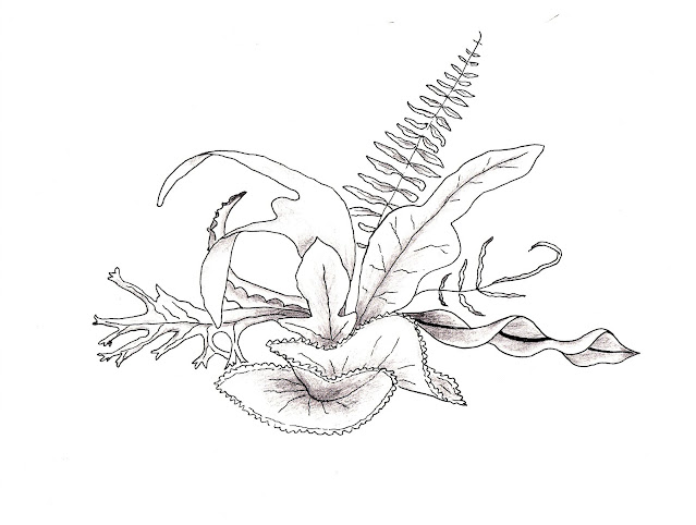
Many years ago, when I was studying interior design, we had to be able to quickly draw objects. The idea was that if we were meeting a client, we would be able to sketch our design idea for the client to see. Anyway, I think we had to do a pencil sketch of plants so I drew a collection of ferns which was growing in and around my home. I really enjoyed doing it and the only tutor criticism that I got was that I didn't do a horizontal line to ground the subject.  Much later, I decided to redraw that picture, turning it into a line and wash using Mission Gold watercolours and a Faber-Castell 's Pitt Artist pen. And I still didn't draw a horizontal line. 🤷‍♀️I have to admit, I prefer it without the colour which I think I executed quite badly. Perhaps in greens less 'in your face' than those I chose would have been much better. 

Vibrant abstract watercolour using Mijello Mission Gold

Image
As usual, when working in my art journals, I like there to be some connection between opposite pages so I did another abstract similar to the one I did yesterday . I didn't fuss or faff around too much and they were a therapeutic way of having fun with paint. They are certainly bright.  The two abstracts together in the journal. I tinkered a bit with the one I did yesterday, making the paint in the centre bloom. I'm not sure if it works but that is how it has been left. For now. As mentioned in my previous post, It's easy to lift paint off Strathmore's watercolour journal and start again. 

Playful abstract with vibrant Mission Gold watercolours

Image
I felt I needed a break from painting things which represent something and decided to play with the brightest, most in-your-face, watercolour brand that I have and that is Mijello Mission Gold. As I have said before, the Strathmore Watercolour Journal does not play nicely. I don't believe there is any cotton in it and paint skims across the surface and lifts off so readily that it is both annoying and useful.  Annoying if you want to paint one colour over another, useful if you make an error or change your mind about the chosen colour. That problem manifested itself in this abstract but at least it didn't really matter. I love the vibrancy of it.  I had thought of defining the shapes with black liner but, after playing around with the image on an editing software (Microsoft Paint), I decided it was better left alone. I had also thought about jazzing it up further with some metallic paints that I have but, again, thought better of it. 

Watercolour Coral Reef

Image
I decided to paint a coral reef opposite the painting of a turtle in my Strathmore 400 watercolour journal. I didn't want to do anything fancy - alright, I admit, I'm not capable of doing a fancy coral reef right now 😆- so I kept it simple. My paintings always look better in the journal than onscreen because most, if not all, paintings look best if you step back a bit. I used the same Mijello Mission Gold paints.  And this is how they look together in the journal.  The reference photo I used for the reef was by Francesco Ungaro on UnSplash Photo of Coral Reef by Francesco Ungaro on Unsplash

Watercolour of Turtle in Caribbean Sea

Image
After my less than successful first line and wash painting of a church in Skipton yesterday, I went for something more simple this time. I like this one, painted with Mijello Mission Gold paints which are vibrant and magic. The Caribbean turtle (possibly a Hawkshead) was drawn with Faber Castell Pitt Artist Pen 0.1 as a guide, then painted in full except for the white detail which was done with white Uni-ball Signo broad. The background (water) was easy, applied as a loose wash of turquoise with touches of grey green (also used on the turtle) added in. Watercolour Turtle Reference photo. I couldn't make out from the photo how submerged the turtle was. I think it was probably in relatively shallow water just under the surface. 

Getting motivated with watercolours

Image
I hear it so very often, not just from amateurs and beginners like myself but also from professional artists, how after a break in painting it is so difficult to get back into it. Shirley Trevena, my favourite artist, said as much. She said she had a love hate relationship with watercolour painting, that it was often difficult for her to start a painting but when she did start she didn't want to stop. I stopped watercolour painting for several months while I chalk painted and decorated my home's furniture, as well as garden tubs and pots and I'll post some of those at some point. I think the best way to get back into it is to steer away from trying to paint anything worthy of hanging on a wall although I find even avoiding that difficult to do.This, an abstract landscape which I shall call Houses on a Hill, was one painting done freely and for fun in a naive style. I didn't worry about colour clashes or perspective (not that I ever really do!) and just went for it.   Ho...

Vibrant fuchsia in watercolour

Image
I tend to be a bit heavy-handed, I suppose, when using watercolours. I know my paintings are a far cry from the paintings of yesteryear where watercolours were used lightly. My excuse, if I have to have one, is that I like vibrant colours. My home is a kaleidoscope of it. My painting of a colourful real-life fuchsia does scream off the paper and here it is, in glorious Mijello Mission Gold watercolours. The metallic bits are created with Coliro. Outlining and petal detail is done with a Faber-Castell Pitt Artist black pen.  Southern Belle Cecil fuchsia in watercolour This my photo of the actual subject flower, Southern Belle Cecile, which was in a hanging basket near to my kitchen door; my garden is in the background.  Southern Belle Cecile fuchsia

Watercolour tulips - a disaster with potential

Image
I plan to share what I consider my best works and my worst. There are plenty of the latter kicking around the house, still, although I do tear up many and use the reverse side as scrap paper for testing watercolour colours on, their granulating effects, and so on. I think I'd watched a tutorial on 'loose' painting for this one which stimulated me into having a go. For me, it's not a success but there are a couple of bits of it that I like.  Watercolour tulips I was throwing paint onto paper with careless abandon - and it shows. I do like the vibrancy shown in a couple of the tulips where there is some detail but I put down the paint so densely that it was beyond saving. I think I might have used this for scrap by now.  I believe the paints used were Mijello Mission Gold. 

Watercolour 'Cat and the Koi Carp '

Image
Prior to this I created a watercolour painting of Koi Carp leaping and I liked it so much I decided to do another in a similar fashion. I posted that earlier. This is, again, using vibrant Mijello Mission Gold watercolours. If you look carefully, you can see the cat face staring at the fish through the water. I made the cat's eyes fish-shaped and the nose like a fish tail. There are swans in the distance, and a frog in the corner too.  Cat and the Koi Carp I don't worry about perspective now, I don't follow rules of any kind that I am aware of. I did have problems creating the splashing of the tails and the surface of the water; something I have no real experience of doing.  I used Grok Imagine to make my above painting come to life.

Watercolour 'Koi Carp Leaping'

Image
Watercolour 'Koi Carp Leaping' I'm not sure what style you would call this painting.  Carp breeding is said to have begun in China but it is the Japanese who have become known for the various breeds of Koi Carp much sought after by collectors. I know how I was inspired to paint it though; there is a channel on YouTube (Eruda Art, also on Facebook) with demonstrations of the most beautiful paintings of this kind, far superior to my own, but I needed to have a go.  Elements in the Painting There is a lot going on as you can see. The Koi Carp, the Asian jars and dishes including the Chinese ginger jar (which exists and is something that belonged to my late mother, originally a birthday present from me), the lilies and the lily pad, and the bamboo canes. Behind the leaping carp is a plate from which water is splashing and the carp is staring into a bowl of water in which there are tiny fish. It's not perfect, I know. There is a major flaw which annoys me and which I may t...

Abstract Watercolour Painting on Yupo Paper

Image
Although I often create my watercolour paintings on 'Cold Pressed/Not' 100% cotton paper I do like to experiment a little. I'm not sure how I came across Yupo paper, probably a video on YouTube, but I wanted to try it. Yupo 'paper' is actually a bit of a misnomer as it is totally synthetic and made from polypropylene resin. Although some might worry about plastics and the environment, on the other hand Yupo is washable and reusable.  It's tricky to use as the watercolour paint is not absorbed but skates around quite uncontrollably on the surface, but any disasters can simply be washed away. I decided this was one to stay.  Mijello 'Mission Gold' paint on Yupo paper I suppose the trick with Yupo is to select colours that do not turn to mud when mixed together because mix together it will if it is given half a chance. I recall how I applied the paint here and there, quite randomly, then 'gently' blew it around with a hair-dryer. If the hairdryer bl...