Posts

Showing posts from November, 2023

A collection of ferns in line and wash (or pen and wash)

Image
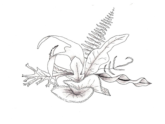
Many years ago, when I was studying interior design, we had to be able to quickly draw objects. The idea was that if we were meeting a client, we would be able to sketch our design idea for the client to see. Anyway, I think we had to do a pencil sketch of plants so I drew a collection of ferns which was growing in and around my home. I really enjoyed doing it and the only tutor criticism that I got was that I didn't do a horizontal line to ground the subject.  Much later, I decided to redraw that picture, turning it into a line and wash using Mission Gold watercolours and a Faber-Castell 's Pitt Artist pen. And I still didn't draw a horizontal line. 🤷‍♀️I have to admit, I prefer it without the colour which I think I executed quite badly. Perhaps in greens less 'in your face' than those I chose would have been much better. 

Ship in a storm using Caran D'ache Neopastels

Image
I always like to learn new things and I don't think I have ever used pastels before, not even as a child. These aren't the dusty ones, though, but the Caran D'ache 'Neopastel' oil pastels. I wanted to experiment and learn as much as I could in one go and I created this on the back page of a brand new Strathmore Mixed Media journal because if it turned out to be an eyesore, I didn't want it to be the first thing I saw when I opened the journal!   I started off without a plan and started stroking the pastels across the bottom of the page, changing colour as I went upwards, still with no idea. When I got to the top, it was then that I got a vague idea for a painting. The good thing about oil pastels is that you can go straight over the top of a previous colour and obliterate it. I hid the top of the painting (which was reds and oranges) with blacks and greys and a bit of blue.  The Neopastels had shown up the slight graininess in the Mixed Media paper and I didn...

Lion face using Coliro metallics on Stonehenge 600gsm black paper

Image
This was a devil to do and I got myself tied in knots. Even so, it looks better in the journal than on the photograph. The camera lens cannot quite catch the luminescence of the paint and the silver hair of the lion looks bluish in the photo.  If I were to do it all again, I'd do it differently with more dragging effect. I didn't decide to drag the side of my brush across the paper until I had done much of it and I think that technique has given the painting an interesting effect. I used a fan brush to do the lion's mane but kept getting blobs. When I swept the brush first over a scrap piece of paper to stop that, then there wasn't enough paint to be effective on the painting and I ended up going back to a plain old brush. sigh. Still, it was a learning curve and, to a degree, I enjoyed the challenge.  Speaking of plain old brushes. Metallics can be rough on expensive watercolour brushes so I used brushes from a set of 50 which I bought on Amazon. They come in handy for...

Tiger face using Coliro metallics on Stonehenge 600gsm black paper

Image
Once more I dove into the deep end with this painting. I traced the tiger's face using an online 'free' photo and I did it with pencil because I knew that the graphite would shine on the black paper surface but I made a big mistake. In my enthusiasm and desire to ensure the tracing showed up I pressed too hard and, instead of carefully going around the traced lines, I went at it like a mad woman. The result was that the pencil transferred to the black paper alright but I ended up with a mass of shallow grooves in the paper. I could hardly see which was what. Anyway, I persevered and eventually gave up with the tracing and grooves and made my own way by guesswork and eyeballing.  Another issue which I knew would happen was the limitation of the colours of metallic watercolours that I have and I wasn't about to order a load more.  You can't shade and glaze like you can with watercolours, or at least I can't, because metallic paint lifts off with the touch of a wet...

Coliro and Iuile metallic paint on black Stonehenge paper

Image
Had a bit of fun this afternoon trying out metallic paints on Stonehenge 600gsm paper. I've used Coliro a few times but Iuile metallics are recent discoveries. None of the paints used are colour-shifting. The doves' outlines were created using a stencil by Annie Sloan as were some of the trees and the houses, the stars were from another stencil set I have, and the moon is by yours truly. One of the positive things about metallics is that you can lift them right off the paper easily enough (that can also be a negative thing!) but also, when dry you can paint over them if you use some care. The colours can be blended, again with care. The only Iuile paints I used were Forest and Lime from the Shimmer range.  The picture loses some of its razzle dazzle in the photograph because, I suppose, the only way to truly show it off would be in a video with the painting tilted back and forth. 

Vase of flowers using watercolour and metallic paints

Image
I created this relatively large watercolour painting several years ago without the use of a reference photo and I didn't like the finished result so I put it in a drawer, hidden away from sight, with a view to maybe painting on the reverse side at some point. Every time since then that I have seen it while looking through that drawer for something or other, I have liked it more. Sometimes it's good to give a piece a chance. That's all I am saying. Give a piece a chance. 🎶😀  I can't remember the name of the watercolour brand, it was painted so long ago, but I do know I used Coliro metallic watercolour paints for that bit of bling. Not only that, the joy of metallics is that they are opaque and can hide a lot of ugly mishaps. 

Playing with Holbein Artists watercolours - an abstract

Image
I used Holbein watercolours for the first time in the same Strathmore Journal that I used to paint the abstract in Mission Gold. It turned out beautifully, like a NASA image of the Orion Nebula but I don't think they are quite as 'in your face' as in the Mission Gold abstract and many of the colours had to be forced to travel although the blues did very well. I wanted to share it as it is presently, although I may tweak it a little, or a lot, at some point with black ink or perhaps even with metallic paints.  This is a NASA image of Messier 42, also known as the Orion Nebula, see  External Links NASA, ESA, M. Robberto (Space Telescope Science Institute/ESA) and the Hubble Space Telescope Orion Treasury Project Team

Rainbow colours with Faber-Castell Albrecht Durer

Image
Several years ago I bought the complete set of Faber-Castell 's 'Albrecht Durer' watercolour pencils. The range of colours is outstanding and, to try them out, I painted this colourful picture on cold press paper by using long strokes of pencil and then applying a somewhat wet brush also in long strokes along the pencil lines. I think of it as Rainbow Silk.  I  sometimes find, though, that with watercolour pencils it can be a little difficult to get rid of the pencil lines but it is good to know that you can also use them by just touching the tip of the pencil with a wet brush to pick up colour. In the image below you can see where I have used both techniques. The visible pencil lines add texture to the painting.   'Rainbow silk' painting with Faber Castell 'Albrecht Durer' watercolour pencils See link to Faber-Castell demonstrating 'Albrecht Durer' pencils on YouTube on my External Links page on the Homepage . 

Makers Cabinet 'Iris' in solid brass with stainless steel leaves

Image
Bought this brass gadget, a circle drawing tool, some little while ago and it is so useful. If I could draw a circle by eye I wouldn't need it but I can't, so there's that. It wasn't cheap but it is quality, is quite heavy for its size. It's so easy to use. I'll place a link to the company and also a link to the YouTube demonstration of it in my External Links page, which can be found on the Homepage, so you can see for yourself.  As you can see, there is a small wooden stand supplied with it but it also serves as a guide to find the centre of the circle. 

Watercolour marbles and a glass jar

Image
I dived further into unknown watercolouring territory today when I painted my first clear glass and colourful marbles. I didn't have any real difficulties with the marbles except for those inside the jar because even the original image seemed unreal. I, more or less, followed a tutorial (link on External Links page) on YouTube for this but my skill and eyesight are obviously not as good as the artist Shaji Chaladan's. He's amazing and deserves a bigger following.  What I found really difficult was the screw top of the jar and in the end had to stop fiddling around with it as I couldn't see what I was doing. I painted it in my Strathmore watercolour journal using Roman Szmal paint. It looks quite pretty in the journal. 

Watercolour seascape with crashing wave on rock

Image
My first watercolour seascape and I'm not unhappy with the result considering it's a first attempt. In fact, I have to admit, it was easier than I thought it would be even though I didn't decide to add a rock, waves, and a crashing wave until I had plastered blue and golden brown all over the place. It's amazing what a bit of white gouache can do! Thanks Schmincke!  I had to stop faffing about with it though. I am sure all watercolour artists have done, and still do,  the same—just add a bit and add a bit and add a bit until you regret it.  This was painted in my Real Stone journal. It looks quite good if you stand back a bit. A lot. 😂

Watercolour green and blue glass vase with gold glitter

Image
This vase is one that I own and is made of glass. No painting of mine could ever show off its true beauty. I had problems painting it (don't I always?) and eventually, in desperation, drew around the watercolour shapes with a Uni-Ball Signo UM-120SP gold glitter rollerball gel ink pen, adding dots of glitter here and there.  🤷‍♀️

Watercolour abstract landscape in Schmincke Horadam

Image
I seldom, if ever (I can't remember) use a painting tutorial as a guide for a painting but I had to try out a video '10 minute short' that I saw on YouTube (link on my External Links page) called A Tiny Forest Scene. I suspect most people find those 'easy' tutorials harder than they look and mine was no exception. It didn't help that it was a high-speed short, not even when I slowed down the speed to one-quarter. Also, unfortunately, the artist did not say which colours and brand of paint was used so I was pretty much in the dark there. I would really have liked to see a full length tutorial with voice over but, still, I don't think my effort turned out too badly.  It was painted using Schmincke Horadam paints in my Real Stone journal.  

Vibrant abstract watercolour using Mijello Mission Gold

Image
As usual, when working in my art journals, I like there to be some connection between opposite pages so I did another abstract similar to the one I did yesterday . I didn't fuss or faff around too much and they were a therapeutic way of having fun with paint. They are certainly bright.  The two abstracts together in the journal. I tinkered a bit with the one I did yesterday, making the paint in the centre bloom. I'm not sure if it works but that is how it has been left. For now. As mentioned in my previous post, It's easy to lift paint off Strathmore's watercolour journal and start again. 

Playful abstract with vibrant Mission Gold watercolours

Image
I felt I needed a break from painting things which represent something and decided to play with the brightest, most in-your-face, watercolour brand that I have and that is Mijello Mission Gold. As I have said before, the Strathmore Watercolour Journal does not play nicely. I don't believe there is any cotton in it and paint skims across the surface and lifts off so readily that it is both annoying and useful.  Annoying if you want to paint one colour over another, useful if you make an error or change your mind about the chosen colour. That problem manifested itself in this abstract but at least it didn't really matter. I love the vibrancy of it.  I had thought of defining the shapes with black liner but, after playing around with the image on an editing software (Microsoft Paint), I decided it was better left alone. I had also thought about jazzing it up further with some metallic paints that I have but, again, thought better of it. 

Tracing art subjects on a computer monitor

Image
Could I draw my subjects freehand? Yes. Do I want to spend three weeks (never said I could do it quickly 😄!) preparing a drawing as a base for a painting when I could 'cheat' and do it in ten minutes? No. If my end result was a drawing, then I would want to do it freehand but when I am champing at the bit to add glorious colour onto paper, nothing is going to slow this racehorse down. Of course, tracing isn't really cheating unless you are entering some kind of a drawing competition. Even the famous modern-day artist, David Hockney, has confessed to the sin and, surprisingly maybe, famous artists of yesteryear have done the same. I'll add a link to a Guardian article about it on my External Links page.  First, I find the subject I want to paint and take a photograph, or find a 'free from copyright' image I wish to use. Usually my paintings are from my own photos. I upload the image to my computer and bring it up on the monitor after 'flipping' (reversi...

Native American in Sennelier watercolour

Image
This was another painting that was way out of my comfort zone. For one thing, it was created in the Strathmore watercolour journal and it's a bit like trying to paint on hot press. Paint lifts so easily off that surface when rewetted and the paint skates around but I admit, I am a poor workwoman blaming her tools. I first saw this 'Native American' figure on YouTube; his name is Alexandro Querevalú and he originally comes from Peru but now lives in Poland! I'll put a link to his website and YouTube channel on my Pages in case you want to check him out.  It took me longer than usual to paint this and I admit I was losing both heart and patience by the time I decided to stop faffing around with it and move on.