Posts

Showing posts from July, 2023

Watercolour seascape of Blackpool Beach

Image
Did I call this blog 'Creating Art the Easy Way'? I might have to rethink this description. Usually I am carefree when I paint but I decided for this one I would put a bit of effort into it. Apparently, I didn't put enough effort into my first attempt at a watercolour seascape. I think I bit off more than I can chew with the subject. My second attempt at getting it right, I feel, is an improvement though far from perfect. I still struggled with the same parts, I think you can see which ones, and it didn't help that some 'specialist' masking tape allowed dark grey to flood onto light brown.  I used Schmincke Horadam paints (my favourite brand) on Fabriano Artistico paper, and overworked it in an attempt to get it just right. To get the speckled effect in the bottom right-hand corner I grated a dark brown watercolour pencil (Faber-Castell's 'Albrecht Durer') onto damp paint.  I used, as the subject, a photograph of Blackpool beach, Lancashire, one day ...

Objects on a striped table with lamplight

Image
This painting was done with Sennelier watercolours paints. I quite like the result, the vibrancy of it all, but I had difficulty with the light shining on the other objects. It's still not right, I'm sure anyone would agree. I lit the lamp as an afterthought and created the light on surrounding objects by damping the paper and lifting paint off the painting with a brush.  I created the stripes on the table by using masking tape and leaving the white of the paper untouched. Every painting of mine has something about it that I would change if I started all over again but each mistake is a lesson learned — right? — and it's more important to have fun unless, of course, you are professional artist and your livelihood depends on the quality of your work.    Objects on a striped table with lamplight

Five minute watercolour doodle

Image
You know those times when the spirit is willing but the body is weak, I very much wanted to paint today but I had had a busy morning and by the time I was free to do it, I was too tired to think straight. So I doodled with watercolours. I chose similar turquoise colours, except one that was more green, of Daniel Smith's regular paints. I chose a brush I hardly ever use, a 3/4" flat brush (I tend to choose round and I think that's a mistake) and I worked on the reverse side of a bad painting. It was fun. I didn't think about it, plan it, worry about it, just went at it. This was the result. It took about 5 minutes to do and far more time selecting which colours I wanted to use.  Wet - 5 minute watercolour doodle I admit, I like it better wet. You can see how the watercolour paint and paper just do their own thing without any interference from artists.  Dry - 5 minute watercolour doodle I might doodle in black ink on this at some point, just for a bit more art therapy.  ...

Some watercolour failures are successes.

Image
Ages ago I was trying to master the art of painting loosely and quickly, and I created this painting. I felt it was a failure and I (edit: thought I had) destroyed it, using the paper for testing colours and so forth. Clearly, I took a photograph of it but now the more I look at it the more I like it. Even though it was an unfinished work and far from perfect—the stems in the vase are just not right—there is something about it.  I think it's the light, the simplicity of it.  Moral of this story is clear, and I shall remember it - hang onto what I perceive as failed paintings for some time. Since first posting this, I found the below painting which I thought I had destroyed, in the bottom of a drawer under a load of other art stuff. I have rescued it. Will I add to it? I don't know but until then it is saved. I don't know what paint brand I used but I suspect it is Mijello Mission Gold due to its 'in your face' vibrancy. 

Watercolour Fruit and Veg Vendor on Caribbean Beach

Image
Yet another painting of a Caribbean beach, which I did a couple of decades ago. Yet again a human subject with a peculiar arm. I need to do better. I thought on looking at it recently that I had painted the bananas badly but, no, it is right. Bananas grow pointing at the sky. It was painting from memory and imagination and I think, with that in mind, it turned out quite well.  Watercolour Fruit and Veg Vendor on a Caribbean Beach Although the painting is far from perfect, I do like it. I suppose because it brings back fond memories of a particular lady called Mintha who was so kind to me, such a sweetheart. I regularly bought fruit and vegetables from her. I found the below photograph of her in an online search.  Mintha, Barbados copyright:  National News.com

Framing artwork cheaply

Image
I don't pay a small fortune for someone to frame my artwork for me because with the money I save I can buy more art material. I often buy unwanted frames from the charity shops and, as well as these below, I bought three giant hardwood frames for less than £20, complete with glass, mats, and backing boards. They are so big that I have them up on a wall, yet devoid of paintings, just so that they are out of my way. 😆 Frames from charity shop Most charity shop frames don't have the mats (mounts) that I want so I have learned to cut my own using a Logan mat cutter. I buy mostly Daler Rowney Studland mountboards - but they aren't cheap so I cut carefully!  If I don't like the finish of the frame, I paint it with Annie Sloan chalk paint, finishing off with the matte lacquer. Some mountboards might have an inner core that is black. I have found that by using a pen with a brush/felt tip I can carefully run around the angle of the cut mat to make it look like it has a black co...

Vibrant fuchsia in watercolour

Image
I tend to be a bit heavy-handed, I suppose, when using watercolours. I know my paintings are a far cry from the paintings of yesteryear where watercolours were used lightly. My excuse, if I have to have one, is that I like vibrant colours. My home is a kaleidoscope of it. My painting of a colourful real-life fuchsia does scream off the paper and here it is, in glorious Mijello Mission Gold watercolours. The metallic bits are created with Coliro. Outlining and petal detail is done with a Faber-Castell Pitt Artist black pen.  Southern Belle Cecil fuchsia in watercolour This my photo of the actual subject flower, Southern Belle Cecile, which was in a hanging basket near to my kitchen door; my garden is in the background.  Southern Belle Cecile fuchsia

Let There Be Light watercolours

Image
A few years back I created a piece of work which I called Genesis because out of the darkness came full spectrum light. I didn't intend it to be anything remotely biblical but sometimes we see something in a painting quite unexpectedly. However, I was pretty new to watercolours, even more of an amateur than I am now, and I had plastered the black on so thickly it started to flake off 😆 so I painted it again more recently and with more care and a somewhat different approach.   Let There Be Light watercolour Genesis 1:3 (King James version) "In the beginning God created the heaven and the earth. And the earth was without form, and void; and darkness was upon the face of the deep. And the Spirit of God moved upon the face of the waters. And  God said, Let there be light: and there was light." The newer painting, which I call Let There Be Light, I painted using Daniel Smith watercolours. Unfortunately, I didn't keep a photograph of the artwork except for the framed one, ...

Watercolour hair braid on Caribbean beach

Image
I laugh when I think of the circumstances in which I painted this watercolour of a lady having her hair braided on a Caribbean beach. I lived in the Caribbean at the time and came back to the UK on a visit. I was staying in a caravan, and having the habit of getting up at the crack of dawn, I painted it there, in the caravan at about 7 am. It was made from imagination. You'd think I might have imagined some English countryside instead.  Hair braid on a Caribbean beach Another thing that always makes me laugh is that, whenever I paint a human, they always seem to have either a wizened arm or a deformed hand. Now, considering I have a healthy arm and hand suspended from both shoulders to look at, for reference...   You get my point, right? 😆 I think I used a small palette of Winsor and Newton pans for this one. It was such a long time ago since I painted it. 

Watercolour prawn-veggie burger with salad and cheese

Image
Someone on social media was just talking about food and now I'm starving. I shall have to wait and I  thought 'I know, I'll post my Hand-Book journal painting of a prawn-veggie burger. Never heard of one? No, neither have I but it's not vegetarian it's pescatarian with lettuce, tomatoes, and cheese and sesame seeds on top. Anyway, this is it, done with Schmincke Horadam watercolours paints and zero calories.  Watercolour prawn-veggie burger with salad and cheese Still hungry. 😔

Watercolour tulips - a disaster with potential

Image
I plan to share what I consider my best works and my worst. There are plenty of the latter kicking around the house, still, although I do tear up many and use the reverse side as scrap paper for testing watercolour colours on, their granulating effects, and so on. I think I'd watched a tutorial on 'loose' painting for this one which stimulated me into having a go. For me, it's not a success but there are a couple of bits of it that I like.  Watercolour tulips I was throwing paint onto paper with careless abandon - and it shows. I do like the vibrancy shown in a couple of the tulips where there is some detail but I put down the paint so densely that it was beyond saving. I think I might have used this for scrap by now.  I believe the paints used were Mijello Mission Gold. 

Beautiful sideboard in watercolour

Image
Once upon a time, a long time ago, I studied interior design for a few years while living in the Caribbean. As the course progressed we had to submit countless mini-tests which went towards our degree grades, and for one test I painted a watercolour of a sideboard. I took the design from a photograph in a magazine (I think it was a Spanish magazine from South America) and so the test must have been for skills in drawing and painting a piece of furniture rather than designing one. These were skills necessary for potential clients in the future. I thought the sideboard so very beautiful (I would love to own it), and worth sharing here.  It's such a long time since I created the above painting but it was done in Winsor and Newton watercolours. I also remember that I laboured over it, and I think the time spent paid off. 

Doodling in watercolours and pen

Image
I was experimenting when doing this colourful piece of artwork in my Hand-Book journal. I'd seen artists on YouTube videos doing abstract art, cleverly laying down paint in many colours, and it worked out so well for them -  but I thought that my work was boring. Boring until I started outlining in black ink (Faber-Castell Pitt Art pens). It's amazing what the use of a black outline can do to a painting, it drags everything into attention, gives our eyes something to focus on.  Watercolour doodle with black ink outlines I started to follow shapes in the watercolours with my pen and it began to resemble countries, borderlines, and then I saw lakes (silver and blue) and mountain ranges (gold). It's amazing what you see, or think you see, when your imagination is kicked into action. I remember when I was a child, staring at the bedroom wallpaper, seeing things that were not there, like faces! 😱 Optical illusions. 

Painting on black with Daniel Smith Luminance range

Image
I had bought a Stonehenge Aqua Black cold press watercolour pad and wanted to try something new. I didn't plan out these two but just went in and the paintings evolved on their own.  The trouble I found was that the paints were easily reactivated when I didn't want them to be. Even so, they were easy to do with no pressure, no planning, no worrying about staining or transparency (they are as transparent or as opaque as you want them to be depending on how much water you use). I call them Cosmic Flora. I think it's a good idea to give your work names—the work that is to keep not throw in the bin (there are special names for those!). Cosmic Flora in Silver Cosmic Flora in Gold

Watercolour 'Cat and the Koi Carp '

Image
Prior to this I created a watercolour painting of Koi Carp leaping and I liked it so much I decided to do another in a similar fashion. I posted that earlier. This is, again, using vibrant Mijello Mission Gold watercolours. If you look carefully, you can see the cat face staring at the fish through the water. I made the cat's eyes fish-shaped and the nose like a fish tail. There are swans in the distance, and a frog in the corner too.  Cat and the Koi Carp I don't worry about perspective now, I don't follow rules of any kind that I am aware of. I did have problems creating the splashing of the tails and the surface of the water; something I have no real experience of doing.  Below is its sister painting.  Koi Carp Leaping

Doodle in MaimeriBlu watercolour paint

Image
I got samples of the MaimeriBlu brand of watercolour paint when I ordered some art material online. The samples were those little dot cards and although small, a little dot can go a very long way. This piece of doodled art is in my Hand-Book Journal and I quite like it in a way, when I step back from it - about 50 yards. 😆 What it was supposed to be is anyone's guess but it reminds me of seashells and flowers.  Doodled art in pen and watercolour I'll put a link to the MaimeriBlu website on my External Links page and you will see they have a wide range of beautiful colours and an interesting history (see The Company on their website). 

Watercolour abstract still life 'Vases'

Image
I wanted to do a vibrant painting using watercolours the heavy-handed modern way and I think I cracked it with this one! The colours shout off the paper. There were no objects in front of me when I did it, no set up, just a medley of shapes out of imagination.  I like it in spite of the obvious errors of judgement. The purple vase on the right has that ridiculous curve at the top, supposedly resembling the top of a vase (or candle or something?) and I really should have just left it square like the others... ...and just look at the shape of the vase in the forefront - the bulge. At least it's not leaning towards the right (or left) as so many of my subjects do if I am not careful. Could I alter it? Would I alter it? No. I think it is things like this that add extra character to a painting. A topic for conversation (and critical abuse).  😆 I remember when I did this painting, a year ago now, how I totally messed up the bottom half. See the texture on the red and the black? Thi...

Watercolour 'The Big Bang'

Image
This is another watercolour painting in my Hand-Book Journal that I wish I had painted separately and larger. The paints look almost metallic but they are not, they are just Schmincke Horadam regular paints. It was fun to do but also I felt to be on an upward learning curve. I've come to realise that I cannot paint a circle, and that often the subjects that I paint tend to lean towards the right although I don't know why.   The Big Bang watercolour

Watercolour 'Egyptian Space'

Image
This is a painting in my watercolour Hand-Book Journal. It reminds me of not just Egyptian things like the pyramids but also of space. It's possibly a subconscious inspiration based on a science fiction movie I had seen, Alien vs Predator (AVP), where two types of extraterrestrials battle it out beneath the Antarctic surface in some kind of underground pyramid. Otherwise, I have no idea how I came up with this but it does seem to work quite well.  Egyptian Space (in a journal) Sometimes, not often, I wish that a painting I have done in my journal were actually a large painting on a separate piece of watercolour paper so, in this case, I painted another. The paint brands used were Schmincke Horadam and Coliro metallics, and Faber-Castell Pitt Artist Pen black ink for outlining shapes.  Egyptian Space It's not difficult to work out that I used plastic templates to create these pieces of artwork. Templates take the pressure off when I can't think of anything to paint or draw, ...

Watercolour 'Koi Carp Leaping'

Image
I'm not sure what style you would call this painting.  Carp breeding is said to have begun in China but it is the Japanese who have become known for the various breeds of Koi Carp much sought after by collectors. I know how I was inspired to paint it though; there is a channel on YouTube (Eruda Art, also on Facebook) with demonstrations of the most beautiful paintings of this kind, far superior to my own, but I needed to have a go.  There is a lot going on as you can see. The Koi Carp, the Asian jars and dishes including the Chinese ginger jar (which exists and is something that belonged to my late mother, originally a birthday present from me), the lilies and the lily pad, and the bamboo canes. Behind the leaping carp is a plate from which water is splashing and the carp is staring into a bowl of water in which there are tiny fish. It's not perfect, I know. There is a major flaw which annoys me and which I may try to put right at some point, I refer to the base of the black v...

Acrylic 'Blue Cat in the Garden'

Image
Several years ago I joined an art group for a while and was tempted out of my comfort zone into painting with acrylics. I say 'comfort zone' although I don't actually have one; I find all painting challenging if I am trying to create something special—so it's best that I don't try.  Other members of the group did all kinds of art, including collages, and that was encouraging. The Blue Cat in the Garden was one of my attempts with acrylic and it came out curiously recognisable considering that I painted it using only my memory and imagination as a guide. I have a Ragdoll cat and he seems to have a lot of pals visiting him in my garden - a regular cohort of cats - so I am used to seeing members of the feline species peering out of my shrubs. Thankfully they don't use my garden as a toilet!  'Blue Cat in the Garden' in acrylics I thought if I created a blog of my art work that it would inspire me to get on with more watercolours but, instead, it has inspire...

Watercolour landscape in a journal

Image
Another painting that is in my Hand Book watercolour journal, this time using M. Graham paints, and I loved the result. It was an easy piece to do, just letting the paint flow and then outlining mountains and valley areas with a Faber-Castell Pitt Artist Pen black ink. I even put small areas of water and plants in there for added interest. I think the colours work very well together. Watercolour landscape using M. Graham paint The thing with creating art in journals is that, for me at least, the pressure is off. I have a bad habit of painting with a view to it being good enough to frame and hang on a wall. That's a mistake. It's like being shackled because the freedom to create without inhibition is lost. 

Watercolour 'The Book Worm at the Beach'

Image
I don't remember why I was inspired to create this particular painting which is an assembly of items that I either own or have owned at one time or another. I enjoyed doing it although it took a while to decide on the pieces that I wanted to incorporate into the picture, and how they should be placed, as well as the size, the colours etc. I'm fairly happy with it except for the blue scarf which is supposed to look as though it is tumbling out of the bag but looks more like the bag is regurgitating it.  The Book Worm at the Beach Even the little owl is a less colourful interpretation of a large bejewelled pendant that I have clipped onto a handbag.  Owl pendant Someone said that the writing in the book must have taken ages to do but it is actually just scribbled words in a fine Faber-Castell Pitt Artist pen which, as a whole, make no sense at all.  I framed this one and have it on my bedroom wall. It looks quite good and is very different from my other paintings. I must do...

Watercolour Bubbletrees

Image
This was a bit of fun and so easy to do. It is just overlapping circles in the three primary colours (red, yellow, and blue) of Schmincke Horadam paint with branches and trunks drawn in last with Faber-Castell Pitt Artist black ink. You can see how overlapping the colours has created green, orange, and purple and how using varying dilutions of paint has intensified or weakened the strength of colour.  Watercolour Bubbletrees

Doodled Octopus with coloured pencils

Image
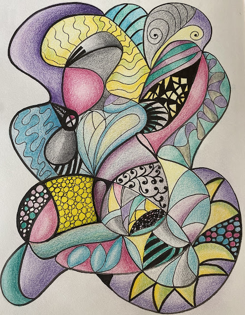
I wasn't thinking of an octopus at the time that I doodled this piece of work in my Strathmore drawing journal but decided, once I had finished, that it did remind me of one. I think some people call this kind of doodling 'Neurographic Art' which apparently has two rules (what, rules now for doodling?) which I didn't pay attention to at the time I did it and which rules I shall continue not to pay attention to in future. My art does not have rules. A Doodled Octopus Seems that Neurographic Art is supposed to come right from the edges of the paper, consisting of freeform lines connecting the conscious with the subconscious, or something along those doodling lines.  For this work, I used Faber-Castell's Polychromos pencils and Faber-Castell's Pitt Artist black pen. Sometimes I like a page in my journal to kind of stand alone and so I paste a sheet of Mulberry paper alongside in an appropriate colour. That paper can be painted on, or drawn on with pen or pencil, at...

An Acrylic Seascape

Image
Occasionally, only very occasionally, I do a painting using acrylics. This was done a few years ago quite quickly and freely, without fussing or worrying, using only my imagination and Winsor and Newton paints. I think it turned out rather well. At least it is atmospheric if not realistic. I recall it was fun to do. I should do more.  Acrylic seascape

Abstract Watercolour Painting on Yupo Paper

Image
Although I often create my watercolour paintings on 'Cold Pressed/Not' 100% cotton paper I do like to experiment a little. I'm not sure how I came across Yupo paper, probably a video on YouTube, but I wanted to try it. Yupo 'paper' is actually a bit of a misnomer as it is totally synthetic and made from polypropylene resin. Although some might worry about plastics and the environment, on the other hand Yupo is washable and reusable.  It's tricky to use as the watercolour paint is not absorbed but skates around quite uncontrollably on the surface, but any disasters can simply be washed away. I decided this was one to stay.  Mijello 'Mission Gold' paint on Yupo paper I suppose the trick with Yupo is to select colours that do not turn to mud when mixed together because mix together it will if it is given half a chance. I recall how I applied the paint here and there, quite randomly, then 'gently' blew it around with a hair-dryer. If the hairdryer bl...

Watercolour Knickerbocker Glory

Image
This watercolour painting of a Knickerbocker Glory was done in a 'Handbook Journal' for watercolours. It was a bit of fun to do but there is no depth to the work, it is totally flat. Even so, it is colourful, you have to admit that much.  This painting was inspired by the dessert I was eating shown in the Introduction page  and the watercolours used were Schmincke Horadam.  Watercolour painting of Knickerbocker Glory

Watercolour Calla Lilies

Image
I used Daniel Smith watercolours for this one and I have it on my bedroom wall next to a painting by Shirley Trevena called Pink Rhododendrons. I won't go as far as to say that I am proud of my work but I do like this one, very much so. It glows. I used a granulating paint in the blue background.  Watercolour painting of Zantedeschia (Calla Lilies) The reason the painting glows is because the light parts of the flowers have been barely touched with paint so that the white surface of the paper shines through. That is the beauty of watercolour paintings. The subject of my painting is from a photograph I took at a garden centre a few years ago. I think you can see I changed the colours a bit - a lot.  Zantedeschia 'Calla Lily'  The frame which I have around my painting is a custom-made ready-to-assemble wooden frame which I have painted with Annie Sloan 'graphite' chalk paint. In fact, I also framed the Shirley Trevena print in a heavy wooden frame which I bought from ...

Watercolour Poppies and a Bumblebee

Image
I often paint from photographs that I have taken so that I have the copyright of both painting and image, and this is no exception. I admit to being a complete amateur and it took me a while to get the courage to share my work online but I wanted to do it, not just to share my work with others but as a way of keeping an online journal.  Watercolour Poppies and a Bumblebee I am an admirer of the work of Shirley Trevena, an accomplished and internationally admired English watercolour artist who not only bends the rules but snaps them in two. By reading her books and watching her demonstrate her skills on her DVD videos, she has given me the confidence to do the same. It's liberating to forget about depth and proportion and perspective and, sacre bleu, Shirley likes to use black in her work. Black is taboo to some professional artists. it is one of those rules. I use black ink (in this case Faber-Castell Pitt Artist Pens) in my art as I have done in the below painting to emphasis the ...